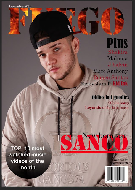
FC, DPS and Contents page (first draft)
- I am mostly done with the Front cover, I will try and make some last improvements like getting rid of the cover star acne and changing the place of the puff. I will change the size of the cover lines because they look a bit big and I think the anchorage should stand out therefore I might change the size of it as well.
- For the DPS I still want to make some changes, I would like to add another small image on the right page and I am not sure if I will keep that pull quote on the left page. Also, I will make the image bigger so that it fills the whole left page.
- The last thing I am working on is the contents page, so far I've chosen the images I want to use and I wrote the title "contents". I really like the pictures I put, however I might change the small one in the right page because it doesn't really blend well with the others. I still need to add the text and arrange the images properly.


your magazine looks really good. you took great pictures and designed it very professionally. i really like the title and how you made it look like fire. My only criticism would be on the double page spread and how the background on the image doesn't go half way through the page which makes it look a bit weird
ReplyDeleteThe shots look phenomenal, I really like the colour scheme and the double page spread looks extremely organised in terms of layout. You can tell where everything is and even the clothing compliments the images, great work. One thing I would say is keep the variety of fonts on the front cover smaller, many fonts can look distracting
ReplyDeleteThe way you've laid your front cover out is very professional, i really like the colour scheme and how your model is positioned however i feel like the model's hat covers too much of the mast head it is not obvious at all what is says, so some will be unaware
ReplyDelete